Waitlisted train travelers can't make confident travel decisions — the booking system shows current status, but never enough context to decide what to do next. That gap, between status and decision, is what this case study solves.
Every waitlisted traveler in India knows this feeling: you book a ticket, and then you wait — refreshing PNR status, guessing at your odds, unsure whether to trust it or panic-book a backup. The system tells you what is happening (WL 34, RAC 12) but never what to do about it.
Current user flow — waitlisted ticket journey
The missing judgment layer. The failure isn't a missing feature — it's a missing judgment layer. Two outcomes result from the same root cause: uncertainty with no guidance attached to it.
Who feels this most. A traveler booking 5–15 days ahead for a fixed-date, non-negotiable event — a wedding, an exam, a job interview, a family visit. The date can't move, but the mode of travel still can. That tension is where the anxiety lives.
What people do today
Refresh PNR status multiple times a day, even when nothing new has happened. Cross-check third-party prediction apps or ask in Telegram/Facebook groups. Rely on folk heuristics passed down from experience ("WL under 20 on this route usually confirms"). Either panic-book a costly backup early, or wait too long and scramble at the last minute.
The system hands over data and lets the user carry the full cognitive load of interpreting it, timing it, and deciding what to do.
The system carries that load instead — turning a probability into a plain-language decision, and staying engaged afterward so the user doesn't have to keep checking.
The high-fidelity flow carries the sketches' logic through to a working system — from checking status, to understanding the prediction, to locking in a backup, to being told the moment things change.


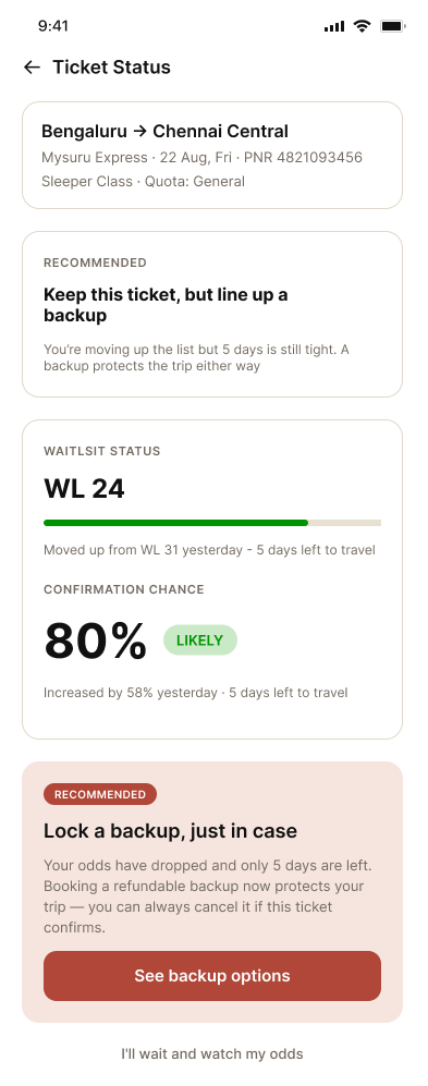
The recommendation leads — "Keep this ticket, but line up a backup" — with the WL 24 position and its recent movement (↑ up 7 places) shown underneath as supporting evidence, not the headline. This was a deliberate flip: an earlier version led with a raw number and a vague "uncertain" label, which repeated the exact failure mode this project set out to fix.
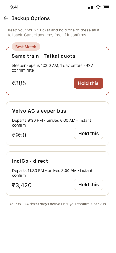
Presents ranked alternates rather than a flat list. The top option is marked "Best match" with a stated reason (same train, fast Tatkal confirmation, doesn't fragment the trip) — showing judgment, not just inventory.
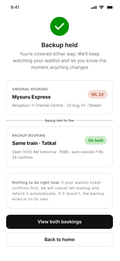
Both bookings — original and backup — are shown stacked together with a connecting label ("backup, held for free"). This directly defuses the most common fear at this step: did I just lose my original ticket? A note confirms nothing further is needed, giving the user explicit permission to stop checking.
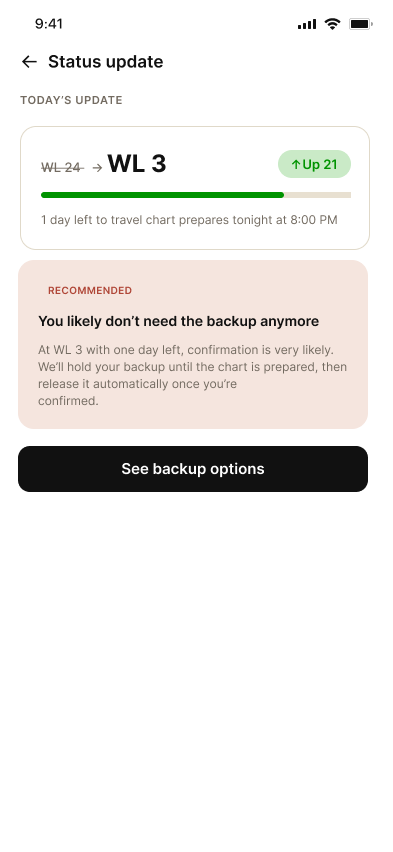
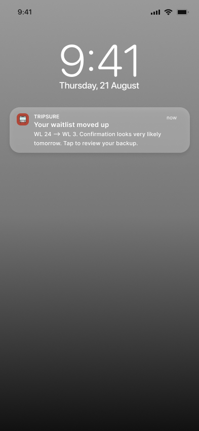
Arrives as a lock-screen notification days later, unprompted — proof that the system stays engaged instead of leaving the user to keep refreshing. The in-app screen it leads to shows the position jump (WL 24 → WL 3) and an updated recommendation, since the right guidance changes as circumstances do.
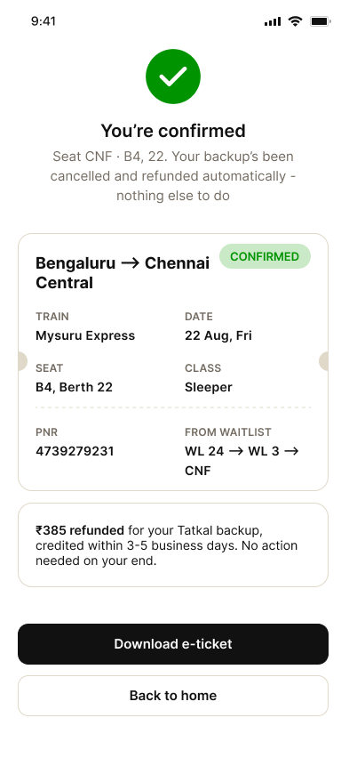
The emotional payoff. The full journey (WL 24 → WL 3 → CNF) is shown as a single line in the ticket details, and the earlier promise from screen 03 — "auto-cancels if confirmed" — is fulfilled here with an explicit refund note. Closing the loop on a promise made earlier is what makes the flow feel like one coherent system rather than disconnected screens.
TripSure doesn't remove uncertainty from waitlisted travel — no tool can. What it removes is the blind wait: a traveler always knows where they stand, what their real odds are, and what their next move is, days before the chart is prepared.
Confidence signals surface days before chart preparation, not hours.
Backup plans can be held and released without penalty or pressure.
Push alerts fire the moment status changes — no manual refreshing.
Five screens sit in a single main stack off the Dashboard; the sixth — Notification — deliberately sits outside it, since its whole job is to reach the traveler without requiring them to open the app first.