Key decisions
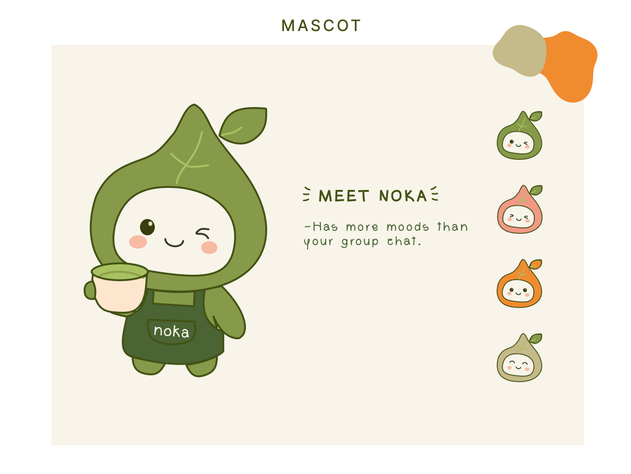
The mascot — a character with moods, not a mascot with one expression
Most café mascots are static — one pose, reused everywhere. Noka's mascot was built as a small set of moods instead — winking, blushing, mid-sip — so the same character can shift tone depending on where it lands: cheeky on a t-shirt, quiet and content on a cookie tin. The brand line leans into this directly: "has more moods than your group chat" — a deliberately casual, self-aware tone that signals Noka isn't trying to be a precious, overly polished café brand.
Colour — two greens doing the grounding work
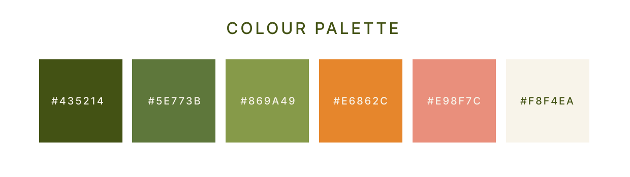
The palette is anchored by two greens rather than one — a deep olive and a softer sage — so the brand has room to feel both natural (tea, leaves, the mascot's leaf hood) and still layered, not flat. Coral and orange sit on top as the "joy" accents — warm, appetite-friendly tones used for energy and detail, never as a base colour, so they read as moments rather than wallpaper.
Typography — a playful display, a plain workhorse
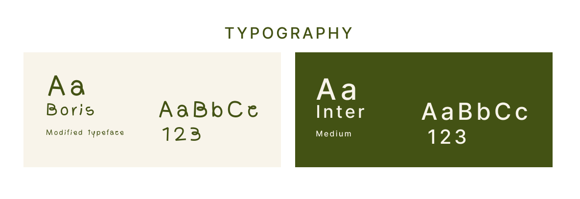
The wordmark runs on a modified, rounded display face — soft enough to sit comfortably next to the mascot without competing with its personality. Everything functional — menus, packaging copy, system text — drops into Inter, so the brand stays legible and calm the moment it's not on-stage.
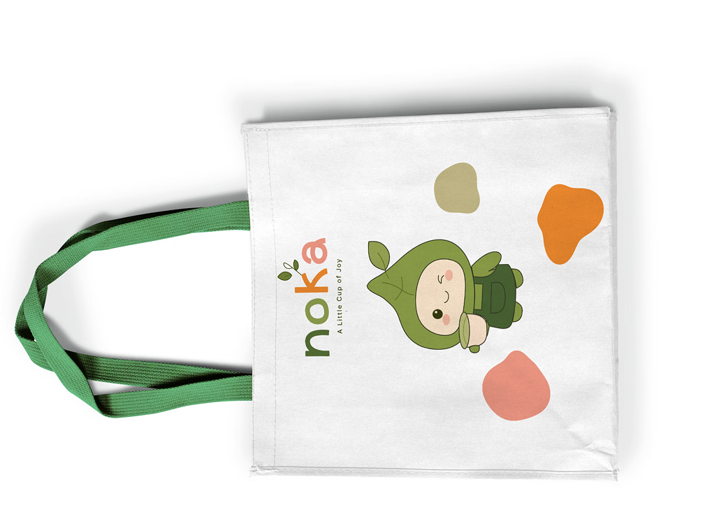
Applications — built to survive the real world, not just a moodboard
The system was stress-tested across the touchpoints a café identity actually has to live on — not just a logo sheet. Packaging, staff merch, and takeaway formats each needed the mascot and palette to hold up at very different scales, from a cup sleeve to a full t-shirt back print.
.png)
.png)